Body
Daily estimates of carbon fluxes in croplands derived from the "ecosys" model at county level resolution, Midwestern US, 2001-2018.

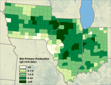
Model-estimated net primary production over the study area on July 18, 2018.
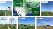
Field sites for ground measurements of solar-induced fluorescence with examples of FluoSpec2 systems.
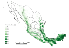
Multi-year mean (2016-2018) of percent tree cover maps for Mexico.
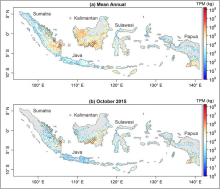
Spatial patterns of the (a) mean annual total particulate matter (TPM) from fire emissions during fire seasons from 2015 to 2020 and (b) TPM from fire emissions in October 2015 across Indonesia. Areas marked with green lines represent peatland areas. Source: Lu et al. (2022).
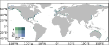
Global salt marsh change represented in a bivariate color scheme.
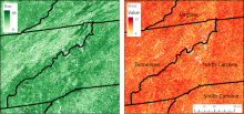
Percent cover of trees (left) and shrubs (right) in 2018 for the southern Appalachian mountains of Tennessee, Virginia, North Carolina, and South Carolina. Areas shown cover four tiles.
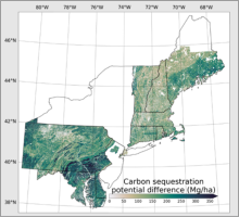
Spatial patterns of forest carbon stores and carbon sequestration potential for the Regional Greenhouse Gas Initiative domain. Map shows carbon sequestration potential difference.
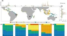
Global distribution of mangrove loss and its drivers. (a) The longitudinal distribution of total mangrove loss and the relative contribution of its primary drivers. Different colors represent unique drivers of mangrove loss. (b) The latitudinal distribution of total mangrove loss and the relative contribution of its primary drivers. (c-g) Global distribution of mangrove loss and associated drivers from 2000 to 2016 at 1-degree x 1-degree resolution, with the relative contribution (percentage) of primary drivers per continent: (c) North America, (d) South America, (e) Africa, (f) Asia, (g) Australia together with Oceania.
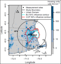
Map of measurement stations in the Boston network. The black line demarcates the 90 km radius circle in which emissions were optimized and the dashed line bounds the urban domain for study. The blue shading represents the number of housing units with natural gas per square kilometer. The red and blue contour encloses 50% of the average footprint initiated at the COP and BU sites, respectively.
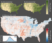
Interannual variation in gross primary productivity (GPP) across conterminous United States. Map of annual mean GPP for 2018 (a) and 2019 (b). Map of the difference in annual mean GPP between 2019 and 2018 (c) wherein red indicates higher GPP in 2019 and blue indicates higher GPP in 2018. The inset in the bottom left corner shows a time series of the average GPP across CONUS for 2018 and 2019.